top of page
GIRLFRIEND
2021
GIRLFRIEND was a quick-turn design challenge concept—a fictional cosmetic brand created to explore how I’d approach visual identity in the beauty industry. Developed in under two hours, the branding balances trend-forward aesthetics with a clean, confident look, proving that even a generic name can feel fresh and memorable with the right design.
Source One Installations
2021
Source One Installations partnered with me to create updated print materials, branded apparel, and a clean, functional website. Focused on clarity and professionalism, the design supports their reputation for expert furniture installation while keeping the visuals straightforward, durable, and aligned with their field-tested approach.
Eyeronic Lash
2022
Eyeronic Lash is a personal brand for a lash extension artist who wanted to break away from the overly cluttered, ultra-girly branding trends of the time. Instead of messy paint splotches and curly fonts, we went with a clean, minimal aesthetic that felt elevated, modern, and intentional—letting the quality of the work speak for itself.
All Pro Fence
2022
All Pro Fence requested a Utah-inspired logo featuring mountains—a common theme among local brands. To set them apart, I flipped the typical approach: instead of using the mountain as a backdrop, I designed a bold fence graphic as the framing element, with a strong, simplified mountain sitting prominently in the foreground. The result feels solid, distinctive, and grounded in place.
The Grazing Feather
2025
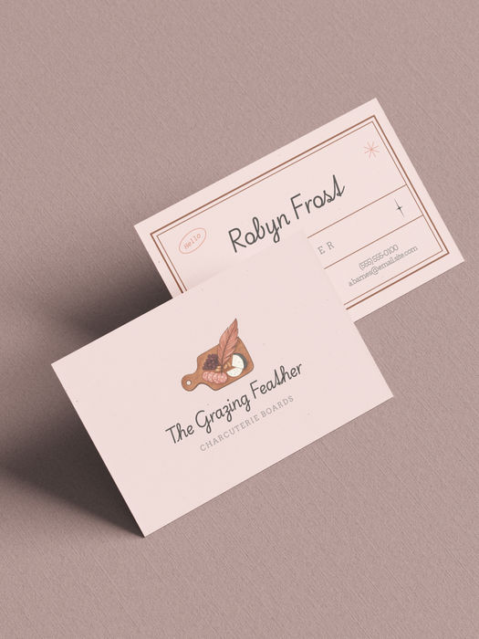
The Grazing Feather came to me with a vision for a black and gold logo featuring a script-style font. After refining their initial concept, I delivered a polished final design in just two rounds—striking the right balance between elegance and simplicity.
Paradigm Shift
2024
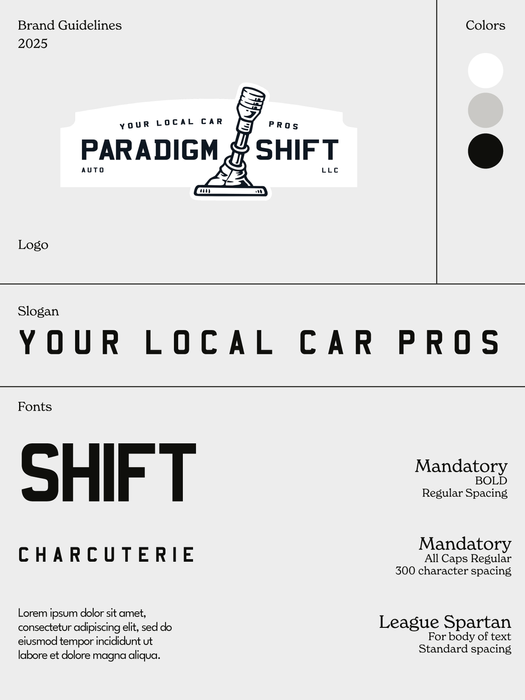
For this used car dealership, I skipped the typical car graphic and leaned into a classic, old-school design to create something more distinctive and authentic. The client chose their final logo after just one round, selecting from two strong options.
Fleur
2021
This client owns an eyelash and brow studio and wanted something timeless and simple. The word mark was used initially, and later, a flower logo was added for depth. The project eventually expanded into a full brand, including stationery design, branding, and website design.
The Color Blue
2024 - Current
The Color Blue is centered on wellness, but with a fresh, playful twist. To break away from the typical oversaturated and bland wellness branding, the client wanted something colorful, fun, and full of personality. This project is a great example of my range and versatility as a creative.
Commercial Contract Group
2025 - Current
CCG is a commercial furniture dealer and interior design firm specializing in curated, strategy-driven spaces that balance form and function. With decades of experience, our branding reflects professionalism, clarity, and approachability. This project showcases my ability to elevate a legacy brand through refined visuals, purposeful storytelling, and a modern, user-focused experience—bringing new energy to a trusted name in the industry.
Alliance co
2025
Alliance Co. is a baked goods brand that leans fully into fun while maintaining a clean, polished feel. Created for a close friend, the branding is lighthearted, approachable, and full of playful energy. With bold illustration and a fresh color palette, this project highlights my ability to deliver personality-driven design that still feels refined and professional.
“Simplicity is not the absence of complexity,
but the clarity that cuts through it.”
- Josef Albers
“The motivation should be Love of the thing.”
- Donald Judd
Scroll up
This site is best experienced on desktop.
For the full design, visuals, and functionality, please come back on a computer.
With Love,
LaVar
bottom of page


